Whether it be in media reports, articles, or apps on our phones, we encounter graphical depictions of critical information. Since the beginning of the COVID-19 pandemic, media outlets have relied on various graphical depictions to convey critical information. Consider the graph below from the NY Times showing the change in spending between 2019 and 2020, attributable to the pandemic.

A quick glance at this graph reveals a few things. For instance, people have greatly reduced their travel and leisure spending (identified by orange circles). On the other hand, with the onset of the pandemic, they have begun to spend slightly more at the supermarket, general merchandise, and online services (grocery deliveries, video, and gaming, etc.). But beyond this, one might be puzzled as to what each one of the bubbles represents. The legend states the bubbles are sized by industry sales and a more detailed analysis of the figure could reveal things like how online grocery shopping has increased by approximately 80% from the previous year, but within the broader market, this is a relatively small industry (unlike supermarkets & general merchandise and e-commerce). Looking at this graph, how would one interpret the more numerous orange than the fewer green bubbles and the impact of changes in spending in the economy? Can one easily conclude anything about whether people on average are spending more or less?
Let’s take a look at another example. Consider the next bubble graph (below) from the World Economic Forum, depicting the world population.
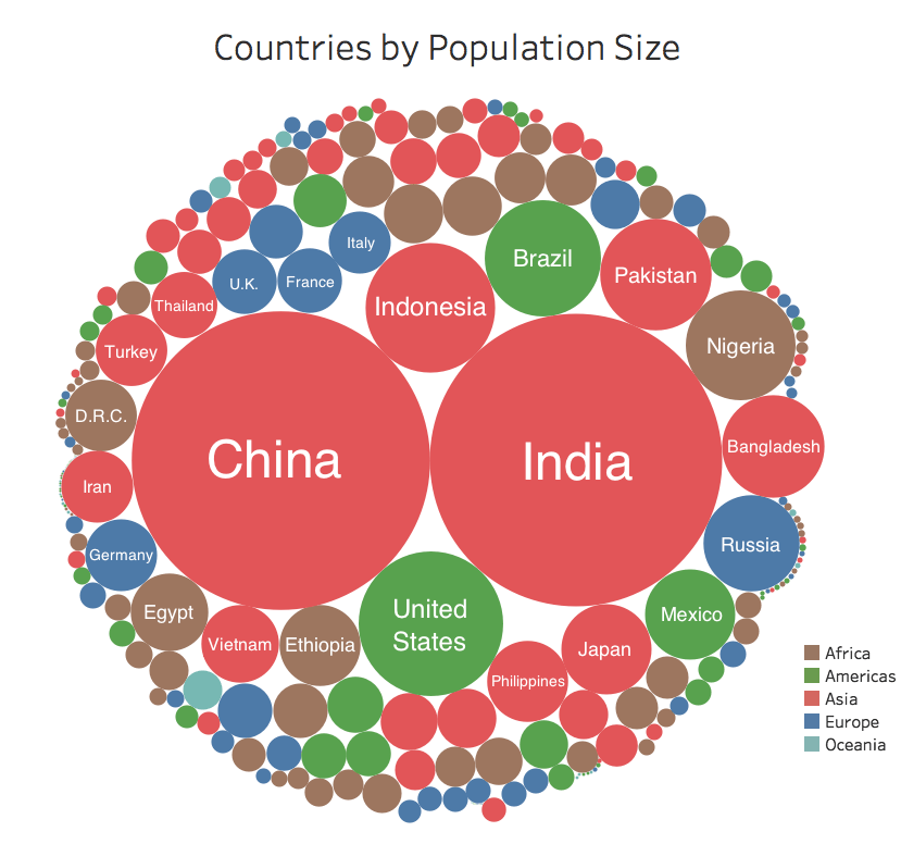
It is no surprise that China and India as the two most populated countries have the largest bubbles and Asia is the most populous continent. One can easily infer this given the dominance of “red” in the figure. In other words, the average size of all the red circles seems to be larger than the average size of all the other colored circles.
But what if we were to compare the total population of African countries (brown circles) with European countries (blue circles)? Now, the answer to this question might not jump out to us. To answer it, we would need to know whether the sum of all the brown circles was larger than the sum of all the blue circles. The fact that these circles are not grouped by color but by size makes these types of comparisons additionally tricky.
In short, to interpret these seemingly easy-to-process bubble graphs, one would need to rely on visual averaging, visual summation, and possibly visual comparison of different sized and colored bubbles. Recent work on visual perception provides a greater understanding of how viewers visually average and sum sets of circles and provides some design suggestions that could increase their effectiveness in communicating information.
What does visual perception research have to offer for bubble chart comprehension?
Let’s start with the basics. Humans are intuitive statisticians.
Once a primary school student masters counting quantities, s/he then is introduced to the notion of taking averages. You simply add all the quantities and divide that sum to the number of owners of whatever those quantities are. This is a relatively simple computation that most master easily. Without using any statistical jargon, people often discuss how certain things/individuals are like the others, implying they have some sense of what is typical of the “others” and also how certain things/individuals are just way different from the rest, implying they also have a sense of the range of properties the “others” vary on. In fact, these bits of implicitly acquired information, play a critical role in shaping perceptual and social group boundaries.
People also implicitly extract statistics about their perceptual environment. Regardless of whether what people encounter are other people, objects, foliage, sounds, they almost automatically summarize these and tag variations from that summary. For instance, unbeknownst to us, we tend to heavily rely on an “average” face when coding the faces of new people and show an implicit preference for those faces with more “average” features. At the peak of the Syrian Refugee crisis, a visual artist, Jeroen van der Most, had even used people’s unconscious reliance on average faces, to demonstrate the minimal impact refugees would likely have on nation-level face averages, as a way to remind people to be open to new coming refugees. We not only easily extract some abstract average face representation, we also extract emotional states from facial cues.
When one walks into a room, s/he can almost immediately determine whether the crowd there is happy or angry and also identify whether there is someone who does not seem to belong there! In nature, when one takes a walk in the woods, an unknown but bright and shiny piece can be quickly identified as not belonging there because it just does not “fit”- to the visual system it is an outlier. Unaware to the viewer, in all these instances the mind is comparing a newly encountered object against what is considered as representative of that broader context. All of these help us determine whether that new item that does not fit the broader context, the “misfit”, needs to be further scrutinized. In other words, our visual system’s summarization of the environment serves a critical purpose. Such summarization is of course not unique to vision. When an amateur plays a variant of a well-known tune but in the midst of it misplays a chord, we immediately pick up that expected dissonant sound – even if we are no musician! We get in a flight-or-fight mode when an unexpected loud noise is heard in an otherwise calm environment. But the question remains, how do our perceptual systems extract such summaries?
For decades researchers have been lured to the question of how our brain and especially how our visual system extracts what is representative of encountered information. There is now consensus that ensemble perception mechanisms capture what is representative of a set of objects both rapidly and rather effortlessly. What still remains unclear is how the brain does that. Going back to the example of taking averages, does our brain sum up the critical features of all encountered items and then divide them with the number of items we had just seen? If that is the case, how come are we so fast and accurate at extracting representativeness information? Because to do that sort of computation we would need to not only keep track of features-of-interest, but somehow quantify them and compute their sum. This problem is further compounded when we discuss certain multi-dimensional properties, like size or facial emotions. For instance, when the perceived average of a set of circles is to be determined, what do we rely on- the total circumferences or the total areas of the circle set. (I don’t even want to consider the cues that drive average facial emotions perception!) On top of these, we would need to know how many feature values we had included in that sum. But, counting takes time and unlike Dustin Hoffman’s character in Rainman, we are not that good at even estimating the number of items we had just seen, especially if there are more than 3 or 4 of those items (but see Approximate Number System). For a second, let’s forgo of all these problems and assume we had both the sum and the count information, our task still would not be done. We would still need to divide whatever sum we have with the relevant count to reach the average. There is sufficient evidence to suggest that the visual system does not follow these rather exhaustive computational steps to extract the average size of a set of items.
So how does the brain extract representative, statistical summaries like averages?
The simple answer is the brain does not extract the average like a young student doing his/her arithmetic homework. While the average tendency of a set of items is very rapidly and accurately extracted from displays, viewers do not seem to have access to the sum of all the feature value summarized. This suggests that the visual system does not have a mechanism devoted to summation. This conclusion was supported by recent work published in the Anne Treisman special issue in AP&P.
In a paper in the AP&P Special Issue, Raidvee and colleagues asked participants to compare the mean diameter, total diameter or the total area of a set of disks to a single probe and determine which was “greater in magnitude”. Simply put, viewers were considerably accurate for the first task, but they were imprecise for the latter two tasks that required summation info. One likely interpretation of these findings is that the visual system seems to have a specialized mechanism devoted to average size detection but not for summation. Even if the total diameter of a set of circles could be computed relatively easily by multiplying the mean diameter with the number of disks, the computation of the total area would require the completion of additional steps. Then, you’d expect people to be even more imprecise at the calculation of total areas than total diameters. But they are not. Thus, even though the visual system has access to basic statistical information summarizing the visual environment – like averages, this extracted mean size summary is not utilized to determine the total size.
With this finding in mind, let’s reconsider the bubble chart examples—
In bubble charts, quantities are typically mapped onto the bubble area. First of all, viewers do not seem to have a way to extract areas; a mapping between circumference (diameter) and quantity would yield a more accurate basis for visualizing patterns. Also, it should be kept in mind that viewers have no way of easily extracting the total area covered by subsets of bubbles, e.g. coded by color. Then, this brings to mind the question of whether bubble graphs are ideal depictions of data where multiple bubbles would need to be summed to make meaningful inferences.
As a final note, Anne Treisman has no doubt had a tremendous impact on cognitive psychology. Her Feature Integration Model has shaped generations’ thinking on visual attention and objecthood. During the final chapter of her career, Treisman published influential papers on ensemble perception identifying critical questions for the field. Raidvee et al.’s work is an extension of these earlier posed questions, with the potential impact for applied vision domains, once again, demonstrating the reach of Treisman’s impact.
Psychonomic Society article focused on this post:
Raidvee, A., Toom, M., Averin, K. & Jüri Allik. (2020). Perception of means, sums, and areas. Attention, Perception & Psychophysics, 82, 865–876. https://doi.org/10.3758/s13414-019-01938-7
